Energy-First? Energy dashboard: customize as desired

The energy dashboard provides a comprehensive overview of energy consumption immediately after installation, but its customization options are initially very limited. However, the current trend of releasing its exclusive features - such as the energy data picker - for general dashboards is exciting.
Energy dashboard = collection of special Lovelace cards
In general, the energy dashboard is a collection of special cards. Embedded in the energy dashboard, these provide a really good overview out of the box with minimal configuration effort, but unfortunately with very few customization options. Don't get me wrong: the dashboard is great and I use it every day, but the longer I use it, the more I want to be able to customize or add a few little things. Although the integrated energy dashboard cannot be changed, it can be recreated in a separate view and thus customized.
Energy cards in their own view
The cards of the energy dashboard can be used in any other view.
With the following examples, the energy dashboard can be completely rebuilt and thus adapted or expanded almost at will:
Energy date picker
This can be added in the footer so that the date selection is fixed on the energy dashboard:


type: energy-date-selection
collection_key: energy_1
The optional key "collection_key" can be used to link the date picker to specific cards. To do this, simply add the collection_key to the following cards.
The following property can be added in YAML so that the "Up" map menu opens:
...
vertical_opening_direction: upsee Statistics chart: Date / time selection
Energy consumption chart

type: energy-usage-graph
collection_key: energy_1
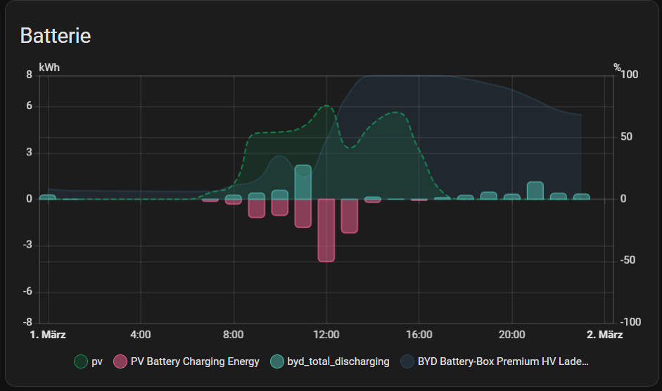
title: Electricity usageSolar production diagram

type: energy-solar-graph
collection_key: energy_1
title: Solar production
Gas consumption diagram

type: energy-gas-graph
collection_key: energy_1
title: Gas consumption
Water consumption diagram

type: energy-water-graph
collection_key: energy_1
title: Water consumption
Energy distribution

type: energy-distribution
link_dashboard: false
collection_key: energy_1
title: Energy distribution
Energy sources table

type: energy-sources-table
collection_key: energy_1
types: grid,gas,overview,battery,solar,water
show_only_totals: true
title: Sources
Power sources

type: power-sources-graph
collection_key: energy_1
title: Power sources
show_legend: false
Net neutrality indicator

type: energy-grid-neutrality-gauge
collection_key: energy_1
Solar consumption indicator

type: energy-solar-consumed-gauge
collection_key: energy_1
Meter for self-sufficiency

type: energy-self-sufficiency-gauge
collection_key: energy_1
Energy diagram for appliances

type: energy-devices-graph
max_devices: 7
collection_key: energy_1
Detailed appliance energy diagram

type: energy-devices-detail-graph
collection_key: energy_1
title: Individual devices detail usage
max_devices: 5
Sankey diagram

type: energy-sankey
collection_key: energy_1
title: Energy flow
Current Power flow

type: power-sankey
collection_key: energy_0
title: Current power flow
Message Compare data

type: energy-compare
collection_key: energy_1
The message appears when you select "Compare data"

Carbon consumption meter
type: energy-carbon-consumed-gauge
collection_key: energy_1
A GitHub pull request for adding energy cards to the Card Picker suggests that something might change to the energy dashboard in the near future. The request would have made it possible to add the energy cards via the interface without YAML, but is on hold for now.
Energy Badge
type: power-total

More cards for any entities
Statistics chart

chart_type: bar
type: statistics-graph
entities:
  - sensor.heating_heat_energy
title: Heizung-Energie
stat_types:
  - change
hide_legend: false
collection_key: energy_1
energy_date_selection: true
Statistics chart

type: statistic
entity: sensor.water_value
stat_type: change
collection_key: energy_1
period: energy_date_selection
Must-have HACS-Karte: energy-custom-graph-card
The HACS card offers considerably more flexibility than the statistics chart card: energy-custom-graph-card. This card also synchronizes the energy date selection, uses the integrated ECharts instance - which provides native styling with minimal overhead - and can be compiled directly in the graphical editor. For aggregated statistics, the type (change, sum, mean, minimum, maximum, state) and the series can be individually selected, including the possibility to compare the data with another time period.
The map is installed via HACS by specifying a user-defined repository:

| Software | Energy-custom-graph |
|---|---|
| GitHub | https://github.com/Thyraz/energy-custom-graph |
| current version | 0.6.3 |
| found | 2026-06-13 |
Fix date
Update March 2026: with the latest Home Assistant update, the date selection can simply be added to the footer: then behaves in the same way as the energy dashboard:


Alternative solution, it is also possible to fix the date picker in the view with the HACS integration: card-mod:
type: energy-date-selection
collection_key: energy_1
card_mod:
  style: |
    ha-card {
        position: fixed;
        z-index: 3;
        margin-top: -10px;
        height: 40px!important;
        width: 500px;
        max-width:100%;
        margin-right: auto;
        margin-left: auto;transition: none !important;
     }
grid_options:
  columns: full
  min-rows: 0.6
  rows: 0.6
Apparently the selector .type-energy-date-selection does not work with the latest Home Assistant versions
Criticism: Energy-First? vs. universal card for date picker?
Why is there no universal card for the date picker as an example for Home Assistant?

Unfortunately, the energy date picker initially only worked with the energy cards. At this point, it seems that the developers wanted to release the energy dashboard quickly without creating the substructure for it. By substructure, I mean cards that can be used more universally for all dashboards. The topic is well known and therefore there is, for example, an effort to make the functionalities accessible for all cards, see: Statistics chart: date / time selection. What remains current is the name of the card: "energy-date-selection". If the card gradually becomes a universal date selection for any card, the name of the card "energy-" at least reveals its origin.
Known misbehavior
Every now and then I wanted the statistics for the last 365 days rather than the last calendar year, which can't be done with just one click using the date picker. When selecting, for example, mid-December last year to mid-December this year, I then noticed that the calculation of the statistics was made up of the whole of December twice: 13 months, which is completely unexpected behavior for me. This was triggered by the fact that whole months are always displayed for time spans greater than one month and the calculation is linked to the display. For this reason, I created a pull request on GitHub: For selections outside of a whole month, the dashboard now uses single days: more of a quick stopgap solution. In another request, I added additional time periods: last 24 hours, last 30 days, last 365 days. For the time period: last 12 months, only whole months are currently displayed, which means that the calculation of the statistics is correct. The display of the last 7 days is different: the current day is also used here, and a whole day is then compared with half a day at the latest:
In general, the "Compare data" function is not available for all maps, especially newer maps usually only show the current time period.
Sources:
- Add (hidden) Energy cards to card picker: https://github.com/home-assistant/frontend/pull/23499
- Fix Energy-Dashboard unexpected Period Calculation: https://github.com/home-assistant/frontend/pull/23458
- Add timespans to logbook, energy and history: https://github.com/home-assistant/frontend/pull/23362
- https://www.home-assistant.io/dashboards/energy/
Current Pull-Requests
Conclusion
The energy dashboard in Home Assistant impresses with its specialized cards and a structured overview, but reaches its limits when it comes to customization. Efforts are currently underway to open up core functions - such as the specific energy period picker (date picker) - for other cards as well. While the module already offers high added value, the greatest potential lies in increased flexibility and the system-wide integration of its functions.
 ({{pro_count}})
{{percentage}} % positive
 ({{con_count}})