Coming soon: tables & reporting in Home Assistant.
Fancy charts? Check. But when it comes to analyzing historical data in tabular form, Home Assistant has quickly become cumbersome. This is exactly what the History Table Card is for: an HACS-Lovelace card that makes long-term statistics directly usable as a flexible table - without having to tinker with SQL in markdown cards.
Anyone who previously had to take the detour via SQL and Markdown (see Displaying Home Assistant data as a table / Reporting) can now configure and evaluate historical data directly in Lovelace.
What are the benefits in everyday life? You get a map that not only displays data, but also enables real analysis: compare equal time periods, calculate key figures directly and build reports that you can really read and pass on.
Purpose
- Evaluate historical energy, consumption and measured values in tabular form instead of just visualizing them.
- Regular reporting for PV, grid consumption, feed-in, battery, temperatures or water/gas.
- Direct comparison of multiple entities per period.
- Calculate your own key performance indicators (KPIs) that do not exist as separate sensors.
Operation in practice
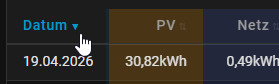
- Sorting: Click on a column heading to sort in ascending order, a second click in descending order.
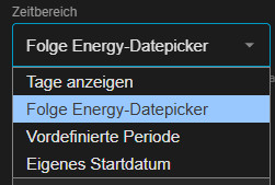
- Control period: Either via the energy date picker (with collection_key) or via a fixed start/end period.
- Reset: The period can be reset to the defined start status using the reset button.
- Date click: Date values can be used as a link to jump into the selected time period.
- Energy-Sync: With collection_key the card takes over the time period of the energy dashboards and updates it back.
Installation via HACS
Add via the following link:

Or in HACS via a user-defined repository:


Repository:LiBe-net/history_table_card
then in HACS: Download
HACS History Table Card: Range of functions in version 1.0
The currently available and productively usable v1.0 functions are listed below.
- Complete GUI configuration editor with tabs, advanced section and area for activated functions.
- Quick selection for entities from the energy dashboard or free selection of any statistical entities.
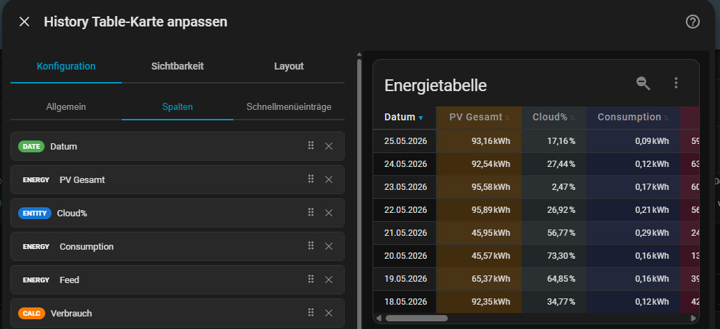
- Energy columns (column type "energy"): Values directly from the energy dashboard as a separate column (e.g. total PV, grid consumption, feed-in, battery, device total).
- Statistic types per column/entity: sum, average, maximum, minimum, status and change for total-increasing sensors.
- Calculation columns with variables (column type "calc") and Jinja2 templates for your own key figures.
- Color design per column: Text color, background color and bullet color configurable.

- Period control in the GUI via display days, predefined period, own start date or energy date picker.
- Adaptive aggregation: automatic selection of granularity depending on the selected time period.
- Column sorting (ascending and descending) by clicking on the column header.
- Vertical table view (classic timeline in line form).
- Sticky header and sticky first column, each separately controllable.
- Initial period can be fixed when loading (initial_period/default_period depending on UI naming).
- Bidirectional synchronization with the energy dashboard via collection_key (table follows picker and vice versa).
Prerequisite, card: energy-date-selection in the dashboard:
Card: "Manual" with the following content:
type: energy-date-selection collection_key: energy_1 - Comparison view with two time periods side by side.
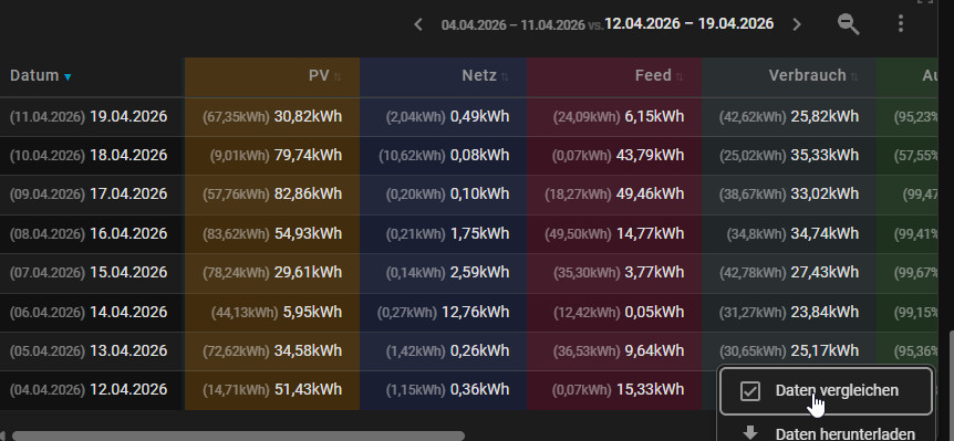
Via the comparison function of the energy datepicker.
Recommended additional card in the dashboard: energy-compare
Card: "Manual" with the following content:
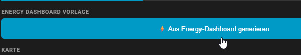
type: energy-compare collection_key: energy_1 - Editor template "⚡ Vertical": automatic column generation from energy data (PV, grid, battery, devices incl. sub-devices, collection key detection).


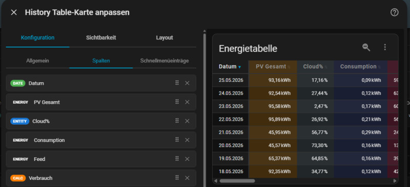
Editor settings: complete overview
General display

- title: Map title.
- date_format: short, medium, long, full.
- sort_col / sort_dir: Start sorting (column, direction).
- Range Mode: Display days, follow energy date picker, predefined period or own start date.
Activated functions (GUI)

- show_reset_button: Show/hide reset button.
- show_date_links: Show/hide date links.
- enable_sort: Globally activate/deactivate sorting.
- sticky_header / sticky_first_col: Kopfzeile und erste Spalte fixieren.
Aggregation (GUI)

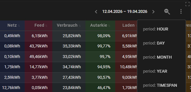
- default_period: Start period (hour, day, month, year, timespan).
- Aggregation per time window: Assignment for hour/day/week/month/year/multiyear via dropdowns.
Column types: Operation and options

The following overview quickly shows which column type is intended for which purpose:
| Column type | What for? | Important options | Typical use |
|---|---|---|---|
| date | Time reference per row (day, week, month ...) | header, date_format, show_date_links | Date axis, drilldown by click |
| entity (or automatically via entity:) | Direct statistical value of an entity | entity, stat_type, unit, decimals (per column), format, alias | PV yield, grid reference, feed-in, temperature |
| energy | Value directly from recognized energy dashboard source | energy_key, stat_type, unit, decimals (per column), alias | PV total, grid consumption, feed-in, battery charging/discharging, total devices |
| calc | Calculated value from multiple sources | template, vars | Self-consumption %, balance, self-sufficiency, average values |
How to use the column types sensibly

- always setdate first so that each line is immediately clear in terms of time.
- Useenergy if the source should already be recognized from the energy dashboard.
- useentity for classic raw values that you want to see directly.
- calc for the actual KPI values that make decisions easier.
Column type: Date
This card is all about historical values for a specific time period. The date should therefore be used as the first column for the table view.

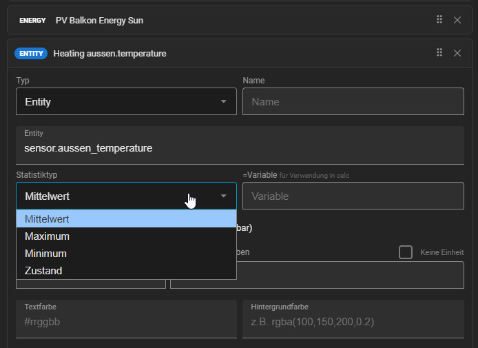
Column type: Entity
Any entities with existing long-term statistics can be added with the Entity type:

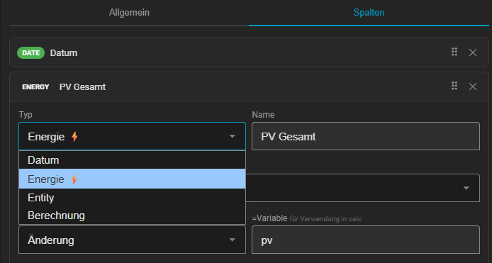
Column type: Energy
The Energy column type is the same as the Entity type, but the sensors configured in the Energy dashboard are available for selection here:

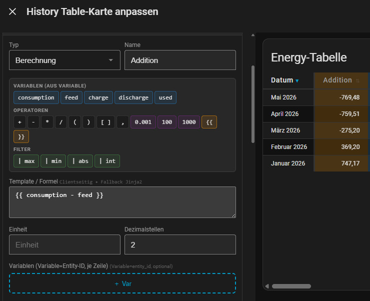
Calculation column type (calc)
Type:calc can be used to create calculations with the existing entities (with existing variables) or with additional variables:

All existing variables are suggested in the editor and can be used in "Template / Formula" with Jinja2 syntax (in this example, simple addition / subtraction of values)
In practice: this is how you proceed
- Define the target KPI: First define what is to be calculated, e.g. self-consumption, balance or self-sufficiency.
- Columns that have already been added are available for the calculation if variable names are specified. Variables can also be created: Under vars, you assign a name for each input variable and enter Entity + suitable stat_type.
- Write formula: In the template, you only use these variable names, not the entity IDs directly.
- Format output: Round the value in the template and add percentage signs or units if required.
Client vs. server-side calculation
The map tries to solve calculations directly in the browser (client-side) as far as possible. More complex calculations are solved on the server side via a Jinja2 template fallback. Here as a demonstration the demo template from Home-Assistant, this is processed correctly:

When sensors are called up in the template, they reflect the current status. Variables can be defined for the column to load the status of an entity for the respective time period:

The fallback to server-side rendering can be seen when editing the map, as a small (s) appears in the preview:

Planned functions (still in beta)
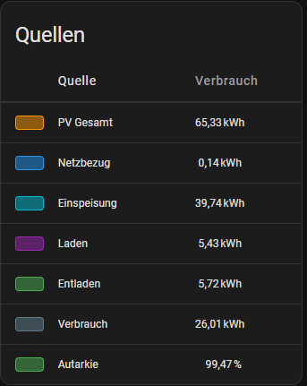
- View: Horizontal timeline incl. Energy Dashboard template ("⚡ Horizontal"): transposed view with one row per energy source, color bullets, single time period value and configurable column widths - as a compact replacement for the Energy Sources table in the Energy Dashboard
- Display of the time period on the map
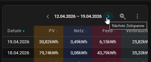
- Forward/backward navigation for time periods.
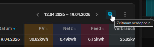
- Period doubling directly from the toolbar (zoom-out):
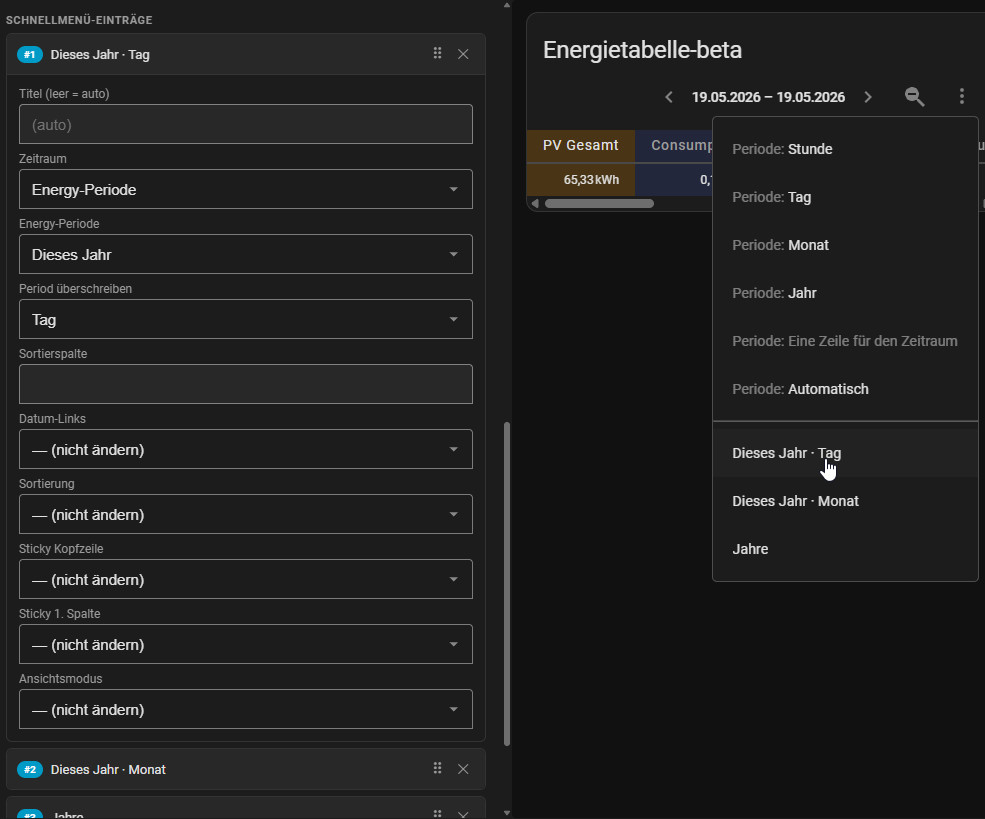
- Configurable quick menu (Quick Menu) with custom entries: Time period, period, view mode, sorting, sticky options and date links can be set for each entry
- Color for header row and first column (background + font color) can be set separately
- Table header can be hidden; configurable column width, cell spacing and row height (max. column width with text shortening via ellipsis)
- Adjustable text alignment
- Maximize table display via an additionally planned universal map (logic outsourced, as this is interesting for any maps: map is still in progress)


Conclusion
The History Table Card v1.0 covers the complete workflow: select data, control time period, calculate values, compare in tabular form and report cleanly. This means that Home Assistant is not only beautifully visualized in everyday life, but can also be evaluated.
 ({{pro_count}})
{{percentage}} % positive
 ({{con_count}})