





 ({{pro_count}})

Question about summing a calculated column in History Table Card
Hello,
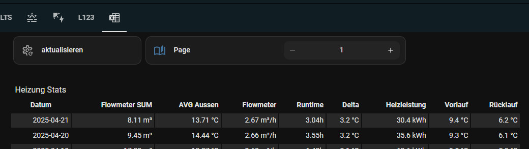
I am using the History Table Card in Home Assistant and I have a question about calculated columns.
I have several calc columns where one calculated column uses the result of other calculated columns.
For example:
* Without battery → calculated value
* With battery → calculated value
* Battery benefit → Without battery - With battery
The hourly values are displayed correctly in the table.
What I would like to do is sum the already calculated values of the Battery benefit column over a day.
In other words:
Hour 1 Battery benefit
* Hour 2 Battery benefit
* Hour 3 Battery benefit
* …
* Hour 24 Battery benefit
= Daily Battery benefit
I do not want to recreate the calculation outside the History Table Card. I want to use the values that the card has already calculated for the Battery benefit column.
I noticed that calc variables can be used by other calculations within the table, but I cannot find a way to use the calculated result of a column as a sum/total over the selected period.
Is there currently a way to do this?
For example, is there a syntax or configuration such as:
* sum: Batterybenefit
* stat_type: sum for a calculated column
* or another way to expose/sum the result of a calc variable?
If this is not currently possible, is there another recommended way to obtain the sum of a calculated column over the selected period?
The important point is that I want to sum the result of the existing calculation, not duplicate the underlying calculation in another sensor.
Thank you!
Hello,
I am using the History Table Card in Home Assistant and I have a question about calculated columns.
I have several calc columns where one calculated column uses the result of other calculated columns.
For example:
* Without battery → calculated value
* With battery → calculated value
* Battery benefit → Without battery - With battery
The hourly values are displayed correctly in the table.
What I would like to do is sum the already calculated values of the Battery benefit column over a day.
In other words:
Hour 1 Battery benefit
* Hour 2 Battery benefit
* Hour 3 Battery benefit
* …
* Hour 24 Battery benefit
= Daily Battery benefit
I do not want to recreate the calculation outside the History Table Card. I want to use the values that the card has already calculated for the Battery benefit column.
I noticed that calc variables can be used by other calculations within the table, but I cannot find a way to use the calculated result of a column as a sum/total over the selected period.
Is there currently a way to do this?
For example, is there a syntax or configuration such as:
* sum: Batterybenefit
* stat_type: sum for a calculated column
* or another way to expose/sum the result of a calc variable?
If this is not currently possible, is there another recommended way to obtain the sum of a calculated column over the selected period?
The important point is that I want to sum the result of the existing calculation, not duplicate the underlying calculation in another sensor.
Thank you!
Questions / Comments