Create / customize Home Assistant dashboards

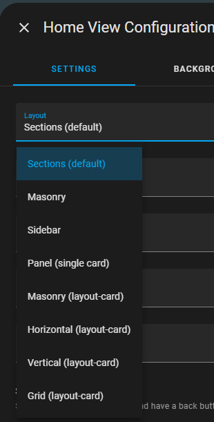
After the first start, all connected devices are automatically displayed in the Home dashboard. The default view of Home Assistant is "Sections". The Sections view allows you to arrange and group the cards using drag and drop.
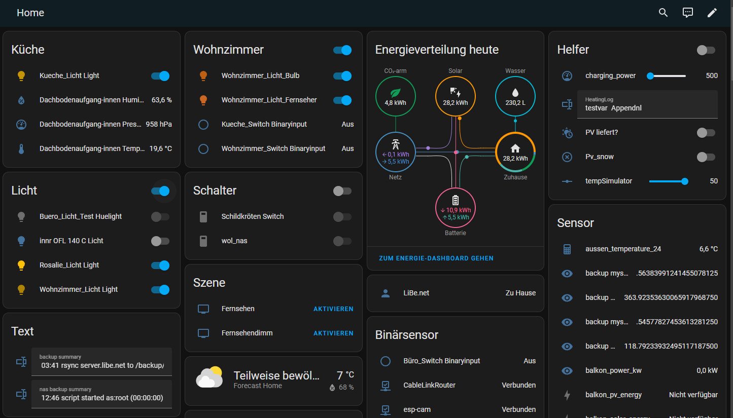
Home Dashboard: Overview
If you create a new dashboard in Home Assistant under Settings / Dashboards, you can choose between an empty or an automatically generated default dashboard:
The dashboards can of course be created and customized by yourself.
the display modules are called "Cards" in Home Assistant:


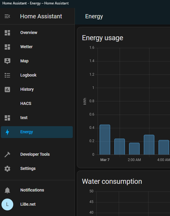
Menu and additional dashboards
In addition to the standard menu items, additional menu items appear for certain integrations. Furthermore, additional dashboards can be created and made available in the menu.
HACS: Must-have frontend packages.
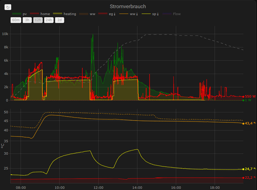
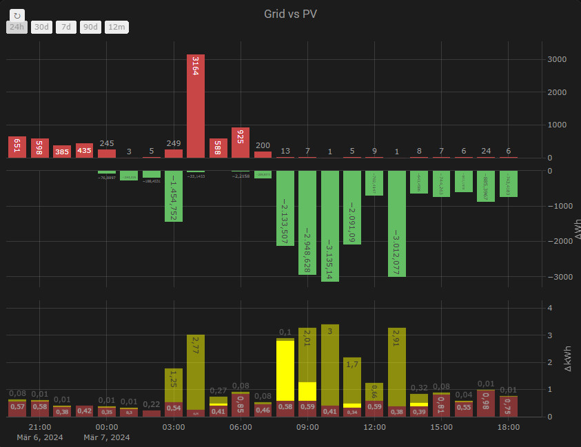
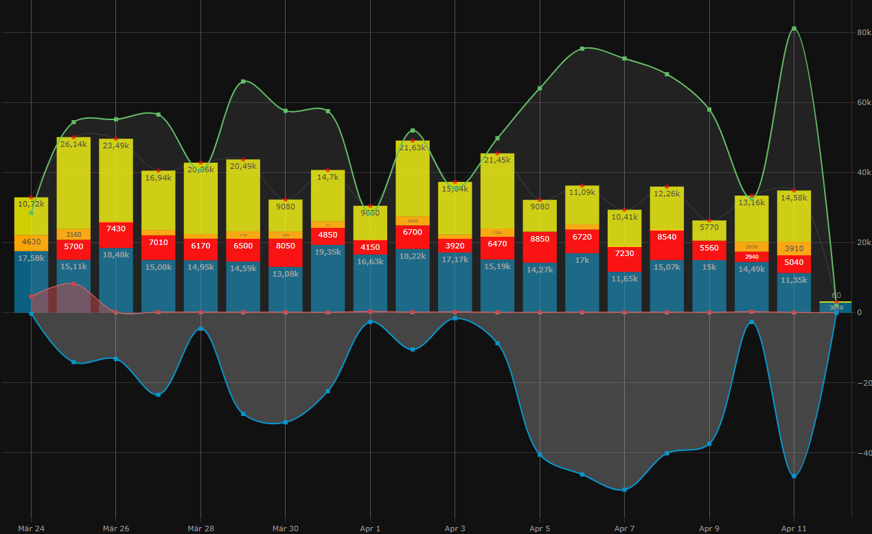
For HACS integration, see: HomeAssistant Integrations. Plotly Graph Card is a definite must-have:
Plotly Graph Card
Since Plotly Graph doesn't necessarily score points visually with the default settings, I had underestimated the card for a long time. But with the right parameters, you can create really beautiful charts. Plotly is a worthy replacement for other graph cards such as"apexcharts-card" or the "history-explorer-card". The highlights of Plotly are its intuitive scroll and zoom function, as well as the countless possibilities to customize the charts as desired:

| Software | Lovelace-plotly-graph-card |
|---|---|
| GitHub | https://github.com/dbuezas/lovelace-plotly-graph-card |
| current version | 2.34.0 |
| found | 2025-04-22 |
For my use cases, Plotly Graph can replace Grafana and an InfluxDB. At this point just have a look at the page again: I'll try to collect a few examples. If you want to customize the layout of certain cards, you can use lovelance-card-mod:
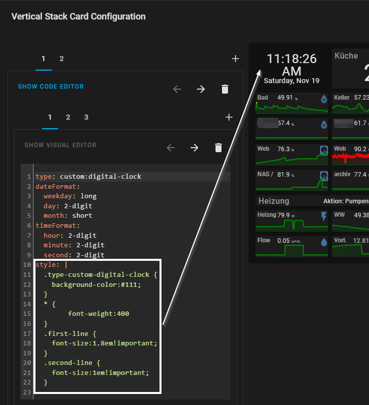
lovelace-card-mod

| Software | Lovelace-card-mod |
|---|---|
| GitHub | https://github.com/thomasloven/lovelace-card-mod |
| current version | 4.2.1 |
| found | 2026-02-10 |
With "lovelace-card-mod" elements in Home Assistant can be customized via CCS styles:
Coming soon: tables & reporting in Home Assistant.
Fancy charts? Check. But when it comes to analyzing historical data in tabular form, Home Assistant has quickly become cumbersome. This is exactly what the History Table Card is for: an HACS-Lovelace card that makes long-term statistics directly usable as a flexible table - without having to tinker with SQL in markdown cards. ... continue reading
Potential for improvement
Statistics diagram: missing date / time selection
Change the date and time of statistics graph cards by selection. ... continue reading
 ({{pro_count}})
{{percentage}} % positive
 ({{con_count}})