HA history: more than 10 days? Long Time Statistic (LTS)

By default, the history in Home Assistant shows the status changes of the last 10 days and supplements older data for certain entities from the Long Time Statistic (LTS).
Home Assistant has its own database tables for saving historical values, which means that the energy dashboard, for example, can also display data older than 10 days. But not only the energy dashboard can use the long-term statistics data.
Entities with long-term statistics (LTS)
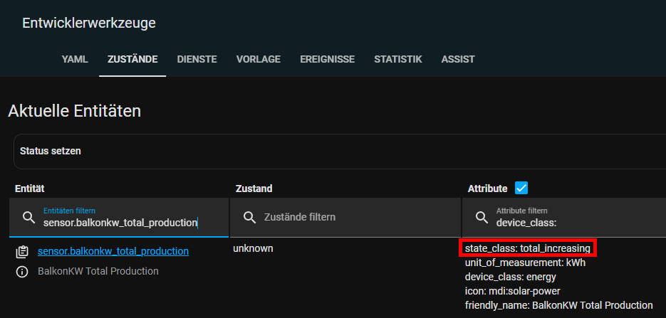
The prerequisite for recording long-term statistics data (LTS) is the attribute "state_class" with one of the properties: "measurement", "total" or "total_increasing".
A look at the developer tools / states tells us whether an entity also records LTS data in addition to status changes.

If the attributes are missing, they can be added via the customize.yaml file.
"total_increasing": for total meters: e.g. the total energy consumption, or "measurement" for status values, such as the temperature.
As an example, no LTS data was recorded for one of my temperature sensors, which can also be seen in "States" in the developer tools:
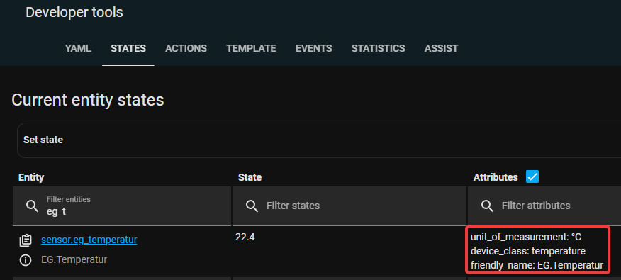
This temperature sensor is obviously missing the "state_class" property, which can be added via a config file.
The missing attribute can be added to the customize.yaml file:
sensor.eg_temperatur:
  state_class: measurement
If the customize.yaml file is missing, it can simply be created and mentioned in the configuration.yaml file:
...
homeassistant:
  customize: !include customize.yaml
...
After adding the missing property and restarting Home-Assistant, "state_class" is added to the attributes:
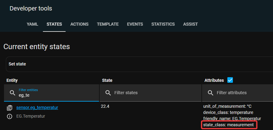
If the attributes are present, the statistics tables are populated:
Historical data in the history
The easiest way to display long-term statistical data is in the history:
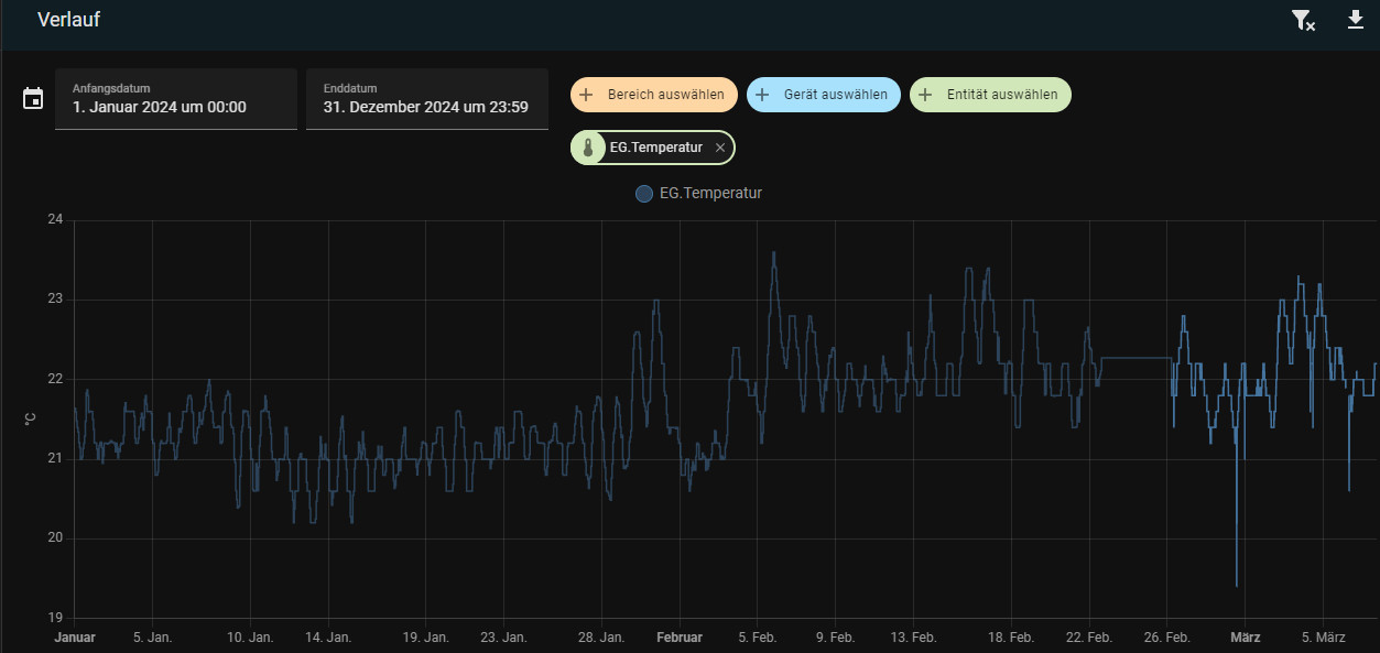
The current data of the last 10 days is displayed slightly weaker in the history, the data from the history tables slightly stronger.
Included in Home Assistant: Statistics chart
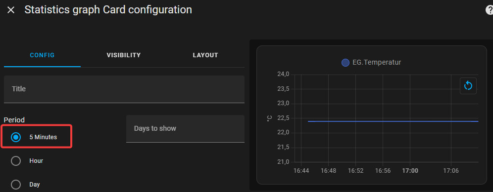
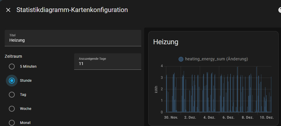
Without additional integration, historical data can be visualized via the Lovelace card "Statistics chart":


If 5 minutes is selected, previously missing statistical data should appear after 5 minutes at the latest:
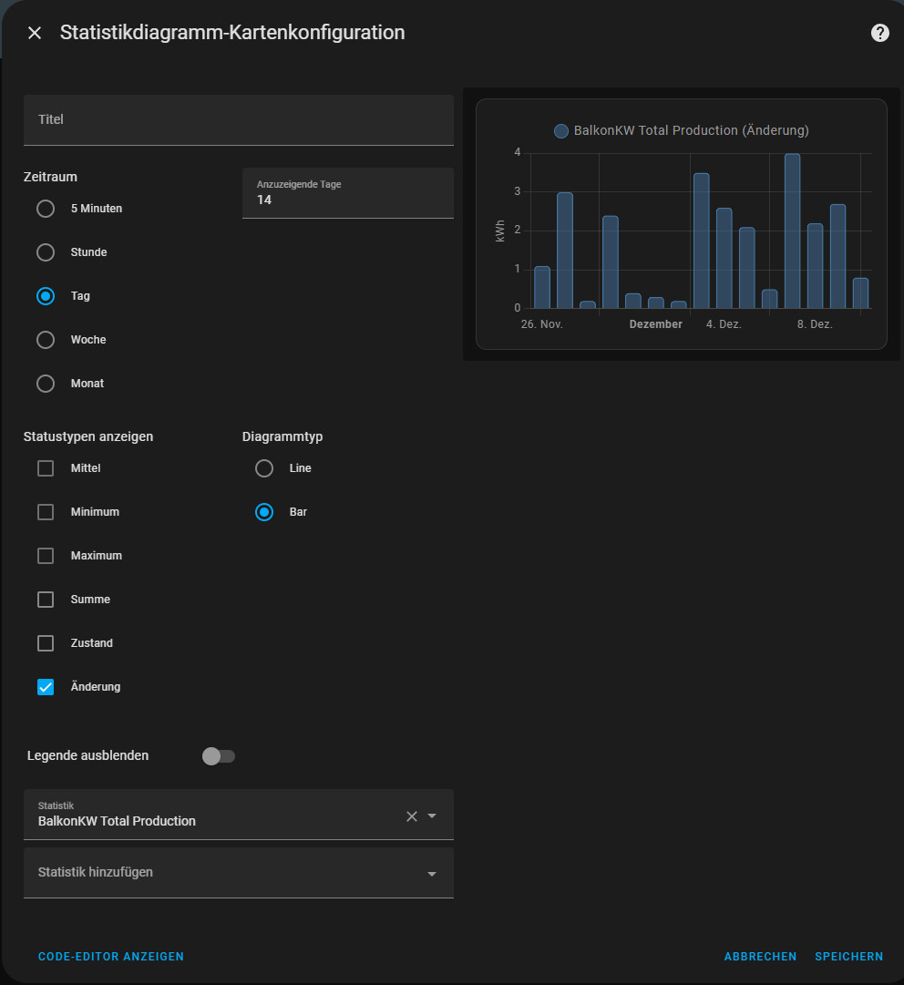
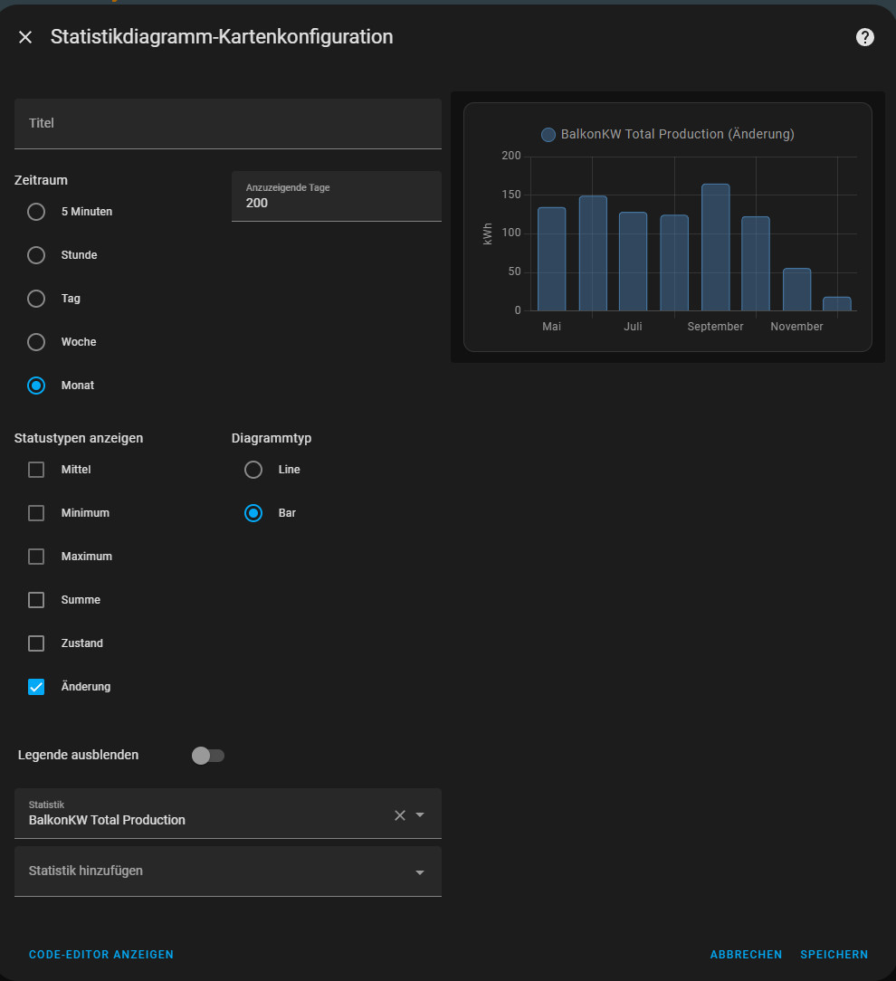
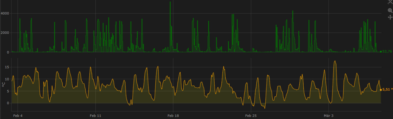
Here is another example of the PV production of my balcony power plant: daily and monthly:
The period or the days to be displayed can be adjusted in the frontend via the date picker of the energy dashboard, but not yet by scrolling to a different time. Until there are further improvements in Home Assistant, certain custom repositories, such as the Plotly Graph Card, can be used. Plotly Graph enables interactive scrolling, zooming in and out of charts. Initially, I only used Plotly Graph for current sensor data, but Plotly can also handle historical data:
Plotly Graph
The "period" option in Plotly Graph adjusts the data points to the zoom factor and uses more or less detail from the statistics tables. The Plotly Graph Card can be installed via the Home Assistant Community Store (HACS).
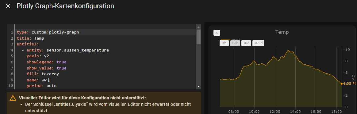
Ploty Graph must be adapted in the YAML editor for the setting. Here is an example for the visualization of a temperature sensor:
type: custom:plotly-graph
title: Temp
entities:
  - entity: sensor.aussen_temperature
    yaxis: y2
    showlegend: true
    show_value: true
    fill: tozeroy
    name: ww🌡
    period: auto
    fillcolor: rgba(255, 255, 0, 0.1)
    line:
      color: orange
      smoothing: 0.5
      shape: spline
      width: 1
hours_to_show: 800
refresh_interval: auto
layout:
  xaxis:
    rangeselector:
      buttons:
        - count: 3
          step: hour
        - count: 12
          step: hour
        - count: 30
          step: day
        - count: 365
          step: day
  yaxis:
    zeroline: true
    fixedrange: true
  legend:
    'y': 1.05
  margin:
    l: 35
    r: 43
Without the "period" option, Plotly uses the current status data. Originally, I also presented the History Explorer Card here. Since Home-Assistant can now access the statistics data via its history and Plotly Graph can be used to create much more flexible cards, I no longer use the card and have removed it here too.
What is behind the LTS function?
Internally, Home Assistant uses various database tables to store data. The "states" table stores all status changes, which not only produces a large amount of data over a longer period of time, but would also affect the performance of Home Assistant. For this reason, Home Assistant deletes data that is older than 10 days. Responsible for cleaning up the status data is the setting: purge_keep_days, which cleans up and deletes data older than 10 days, see: www.home-assistant.io/integrations/recorder/. However, changing this setting is not necessarily a good idea, as a longer period produces more data and Home Assistant is slowed down if the value is too high.
In order to still be able to access data older than 10 days, Home Assistant determines the average, minimum, and maximum values for the sensors and writes them to its own tables:
The average, minimum and maximum values are stored in the "statistics_short_term" table every 5 minutes. The statistics_short_term table also discards data that is older than 10 days, just like the original "states" table. This is different for the "statistics" table, which stores the statistics data average, minimum, and maximum values for each hour and does not delete them. A look at the SQLite database shows us the data:

Home Assistant uses Unix timestamps as the format for the date and time:

To convert the Unix timestamp to a readable date, I have published a small JavaScript tool on this page: Convert Date: Unix Timestamp
Home-Assistant's internal database structure can also be surmised from the following example: If I try to set 5 minutes as the time period in the statistics card, it can only display up to 10 days. If I were to select an 11th day, the card would no longer display anything: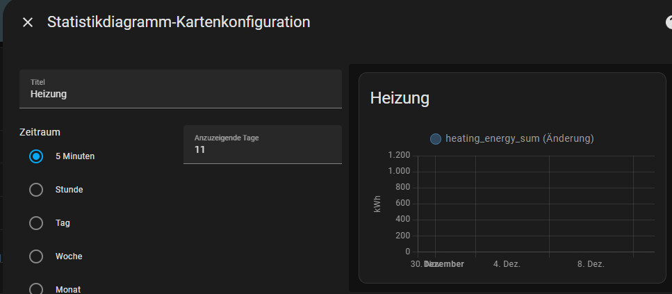
However, if I switch to "hour", the map obviously uses the "statistics" table and also displays data older than 10 days:
Check directly via a database query:
After the data in the "statistics_short_term" table is written to the database every 5 minutes, data from the sensor should appear in the "statistics_short_term" table after this time at the latest. For additional information on accessing the database, see: Home Assistant SQlite - Change statistics data
Database query:
select STRFTIME('%Y.%m.%d %H:%M', datetime(created_ts, 'unixepoch', 'localtime')) as date, * from statistics_short_term where metadata_id = (SELECT id FROM statistics_meta WHERE statistic_id = 'sensor.eg_temperatur') order by created_ts DESC;Of course, the sensor ID, here "sensor.eg_temperature" must be adjusted in the query:

An entry should then also appear in the "states" table at every full hour, here is the corresponding query:
select STRFTIME('%Y.%m.%d %H:%M', datetime(created_ts, 'unixepoch', 'localtime')) as date, * from statistics where metadata_id = (SELECT id FROM statistics_meta WHERE statistic_id = 'sensor.eg_temperatur') order by created_ts DESC;
Conclusion
The behavior of Home Assistant when saving sensor data is more or less a compromise between the details saved and the age of the data: All status changes are available for the last 10 days; beyond that, the statistics table can only be accessed at hourly intervals. In terms of functionality, Home Assistant has made some progress here in the past, but Home Assistant cannot keep up with a timeseries database such as InfluxDB when it comes to saving historical data or with a solution such as Grafana when it comes to visualization. If you can live with the fact that data older than 10 days is only available on an hourly basis, Plotly Graph is still a worthy alternative.
 ({{pro_count}})
{{percentage}} % positive
 ({{con_count}})