Display / output Home Assistant data as a table - Reporting
Charts are great, but a simple table view of historical data would be desirable for certain evaluations. Unfortunately, Home Assistant has very little to offer out of the box. Only certain cards can access the history data, but then without any possibility to edit, filter or customize the data. As a solution, I am working on a HACS integration in parallel to this guide: now available: Tables & evaluations in Home Assistant.
It is only possible to output any SQL queries from the database as a table in a Lovelace card in a roundabout way, which is the aim of this article.
Why this is so, see: Home Assistant special features: Strengths and Weaknesses
The example presented here includes data from five different entities that are read from the database, stored in an entity and output via a markdown card in Lovelace. In the markdown card, certain columns can be calculated based on the values of other columns: e.g. the column: "Delta" is calculated from "Lead" and "Return". For this example, I have used the custom integration sql_json . However, certain database values can also be displayed in a Lovelace card without the HACS integration sql_json:
☑SQL integration: JSON
Using the existing SQL integration, it is possible to save the result for certain SQL queries in a separate sensor, see: Home Assistant SQL integration. Stored in JSON format, the data can be output relatively easily as a table via a markdown card. Here is a concrete example for the daily PV yield: SQL integration sensor, see:

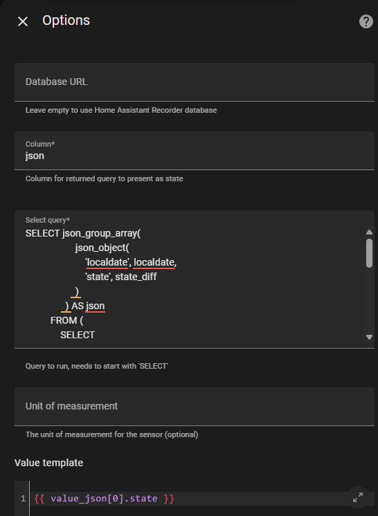
Below is the SQL query used for a continuous entity (energy meter):
SELECT json_group_array(
                    json_object(
                        'localdate', localdate,
                        'state', state_diff
                    )
                ) AS json
          FROM (
              SELECT
                  ROUND(MAX(state) - MIN(state), 2) AS state_diff,
                  DATE(datetime(created_ts, 'unixepoch', 'localtime')) AS localdate
              FROM
                  statistics
              WHERE
                  metadata_id = (
                      SELECT id
                      FROM statistics_meta
                      WHERE statistic_id = 'sensor.pv_panels_energy'
                  )
                  AND state NOT IN ("unknown", "", "unavailable")
              GROUP BY
                  localdate
              ORDER BY
                  localdate DESC
              LIMIT 100
          );
The sensor: sensor.pv_panels_energy must of course be adapted accordingly. To ensure that the query works, it should be tested in advance, see: 3 variants: SQLite database access - Home Assistant.
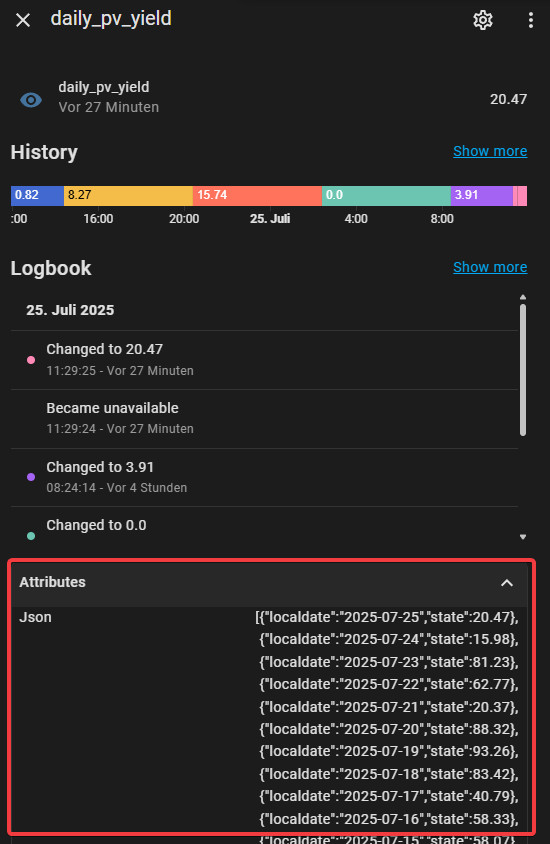
The query saves the values as attributes, which means that, unlike the entity value, more than 255 characters can be saved:
These values can then be displayed as a table in a Markdown card:
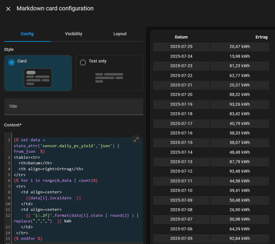
Markdown:
{% set data = state_attr('sensor.daily_pv_yield','json') | from_json  %}
<table><tr>
  <th>Datum</th>
  <th>Ertrag</th>
</tr>
{% for i in range(0,data | count)%}
 <tr>
   <td align=center>
     {{data[i].localdate  }}
   </td>
   <td align=center>
     {{ '{:.2f}'.format(data[i].state | round(2) ) | replace(".",",")  }} kWh
   </td>
 </tr>
{% endfor %}
Caution with large amounts of data: Queries run every 30 seconds
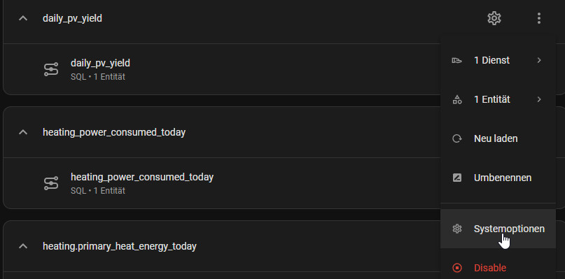
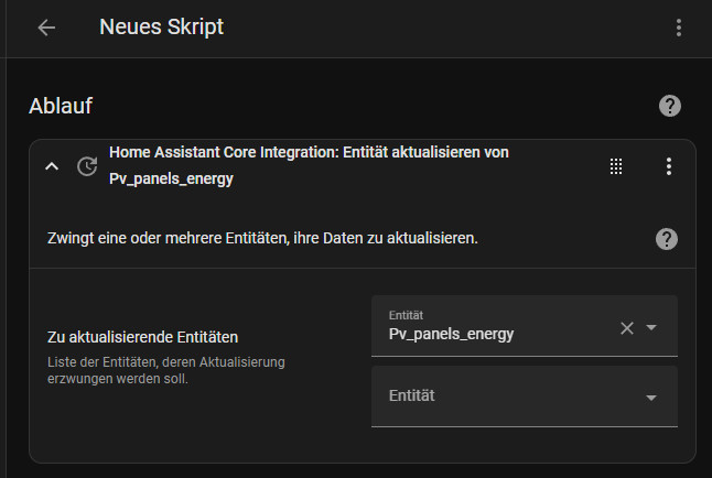
By default, SQL queries are executed every 30 seconds, which could slow down Home Assistant very quickly, so large queries should be excluded from the standard polling:

The query can be executed on demand via a script or regularly via automation:
Combine certain entities in a query
With this variant, the data from several sensors can be combined; here is the corresponding query for the example presented at the beginning of this article:
          SELECT  json_group_array(
                  json_object(
                      'localdate', flowmeter_sum.localdate,
                      'flowmeter_sum', flowmeter_sum.state_diff,
                      'aussen_temperatur_mean', aussen_temperature.state_mean,
                      'flowmeter', flowmeter.state,
                      'heating_vorlauf', heating_vorlauf.state_min,
                      'heating_ruecklauf', heating_ruecklauf.state_min
                  )
              ) AS json
          FROM (
              SELECT
                  ROUND(MAX(state) - MIN(state), 2) AS state_diff,
                  DATE(datetime(created_ts, 'unixepoch', 'localtime')) AS localdate
              FROM
                  statistics
              WHERE
                  metadata_id = (
                      SELECT id
                      FROM statistics_meta
                      WHERE statistic_id = 'sensor.flowmeter_sum'
                  )
                  AND state NOT IN ("unknown", "", "unavailable")
                  AND DATE(datetime(created_ts, 'unixepoch', 'localtime')) < DATE('now')
              GROUP BY
                  localdate
              ORDER BY localdate DESC
          ) flowmeter_sum
          LEFT JOIN (
              SELECT
                  ROUND(AVG(mean), 2) AS state_mean,
                  DATE(datetime(created_ts, 'unixepoch', 'localtime')) AS localdate
              FROM
                  statistics
              WHERE
                  metadata_id = (
                      SELECT id
                      FROM statistics_meta
                      WHERE statistic_id = 'sensor.aussen_temperature'
                  )
                  AND mean NOT IN ("unknown", "", "unavailable")
              GROUP BY
                  localdate
          ) aussen_temperature ON flowmeter_sum.localdate = aussen_temperature.localdate
          LEFT JOIN (
              SELECT
                  ROUND(max(mean), 2) AS state,
                  DATE(datetime(created_ts, 'unixepoch', 'localtime')) AS localdate
              FROM
                  statistics
              WHERE
                  metadata_id = (
                      SELECT id
                      FROM statistics_meta
                      WHERE statistic_id = 'sensor.flowmeter'
                  )
                  AND max NOT IN ("unknown", "", "unavailable")
              GROUP BY
                  localdate
          ) flowmeter ON flowmeter.localdate = aussen_temperature.localdate
          LEFT JOIN (
              SELECT
                  ROUND(min(min), 2) AS state_min,
                  DATE(datetime(created_ts, 'unixepoch', 'localtime')) AS localdate
              FROM
                  statistics
              WHERE
                  metadata_id = (
                      SELECT id
                      FROM statistics_meta
                      WHERE statistic_id = 'sensor.heating_ruecklauf'
                  )
                  AND max NOT IN ("unknown", "", "unavailable")
              GROUP BY
                  localdate
          ) heating_ruecklauf ON flowmeter.localdate = heating_ruecklauf.localdate
          LEFT JOIN (
              SELECT
                  ROUND(min(min), 2) AS state_min,
                  DATE(datetime(created_ts, 'unixepoch', 'localtime')) AS localdate
              FROM
                  statistics
              WHERE
                  metadata_id = (
                      SELECT id
                      FROM statistics_meta
                      WHERE statistic_id = 'sensor.heating_vorlauf'
                  )
                  AND max NOT IN ("unknown", "", "unavailable")
              GROUP BY
                  localdate
          ) heating_vorlauf ON heating_ruecklauf.localdate = heating_vorlauf.localdate;
Markdown-Card-Inhalt:
{% set data = state_attr('sensor.daily_heating','json')  | from_json %}
<table><tr>
  <th>Datum</th>
  <th align=right>Flowmeter SUM</th>
  <th align=right>AVG Aussen</th>
  <th align=right>Flowmeter</th>
  <th align=right>Delta</th>
  <th align=right>Vorlauf</th>
  <th align=right>Rücklauf</th>
</tr>
{% for i in range(0,data | count)%}
 <tr>
   <td align=right>
     {{data[i].localdate  }}
   </td>
   <td align=right>
     {{ '{:.2f}'.format(data[i].flowmeter_sum | round(2))  }} m³
   </td>
   <td align=right>
     {{ '{:.2f}'.format(data[i].aussen_temperatur_mean | round(2, 'floor')) }} °C
   </td>
   <td align=right>
     {{ '{:.2f}'.format(data[i].flowmeter| round(2, 'floor'))}} m³/h
   </td>
   <td align=right >
     {{ '{:.1f}'.format((data[i].heating_vorlauf - data[i].heating_ruecklauf) | round(1, 'floor'))  }} °C
   </td>
   <td align=right>
     {{ '{:.1f}'.format(data[i].heating_vorlauf | round(1, 'floor')) }} °C
   </td>
   <td align=right>
     {{ '{:.1f}'.format(data[i].heating_ruecklauf | round(1, 'floor')) }} °C
   </td>
 </tr>
{% endfor %}
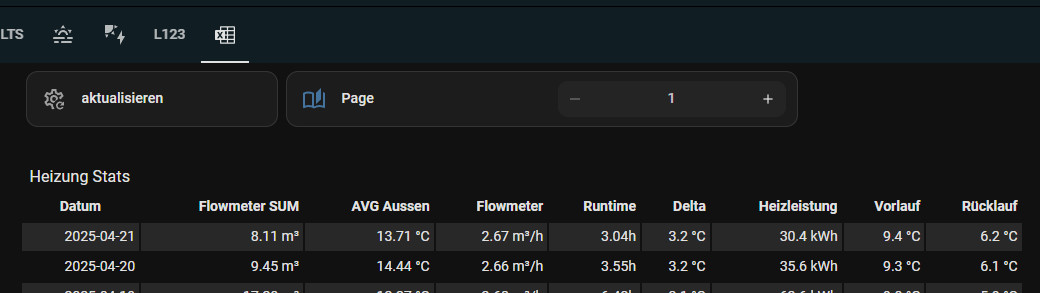
Markdown-Card Limit
Displaying data with more than 262144 characters overloads the Markdown card and leads to an error:

One way to circumvent the limit of the Markdown card is a helper for displaying pages: "input_number.heating_pagination"

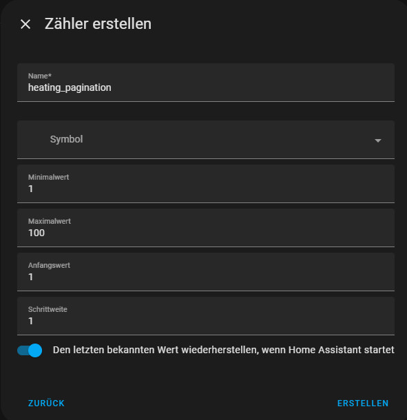
The helper can then be used in the Markdown card. The variable "numlist" limits the number of entries per page:
type: markdown
content: |
{% set data = state_attr('sensor.daily_heating','json') | from_json %}
{% set pagination = states('input_number.heating_pagination') | int(0) %}
{% set numlist = 500 %}
{% set start = (pagination * numlist) - numlist %}
{% set end = start + numlist %}
{% if(end > (data | count)) %}
{% set end = data | count %}
{% endif %}
<table><tr>
<th>Datum</th>
<th align=right>Flowmeter SUM</th>
<th align=right>AVG Aussen</th>
<th align=right>Flowmeter</th>
<th align=right>Runtime</th>
<th align=right>Delta</th>
<th align=right>Heizleistung</th>
<th align=right>Vorlauf</th>
<th align=right>Rücklauf</th>
</tr>{#data | count#}
{% for i in range(start, end)%}
<tr>
<td align=right>
{{data[i].localdate }}
</td>
<td align=right>
{% if (data[i].flowmeter | float(0) > 0.5) %}{{ '{:.2f}'.format(data[i].flowmeter_sum | float(0) | round(2)) }}{% else %}-{% endif %} m³
</td>
<td align=right>
{{data[i].aussen_temperatur_mean | float("n/a")}} °C
</td>
<td align=right>
{{ '{:.2f}'.format(data[i].flowmeter| float(0) | round(2, 'floor'))}} m³/h
</td>
<td align=right>
{% if (data[i].flowmeter | float(0) > 0.5) %}{{ '{:.2f}'.format(data[i].flowmeter_sum | float(0) / data[i].flowmeter | float(0) | round(2, 'floor'))}}{% else %}-{% endif %}h
</td>
<td align=right >
{% if (data[i].flowmeter | float(0) > 0.5) %}{{ '{:.1f}'.format((data[i].heating_vorlauf | float(0) - (data[i].heating_ruecklauf) | float(0)) | round(1, 'floor')) }}{% else %}-{% endif %} °C
</td> <td align=right >
{% if (data[i].flowmeter | float(0) > 0.5) %}{{ '{:.1f}'.format(((data[i].heating_vorlauf | float(0) - (data[i].heating_ruecklauf) | float(0))) * 1.163 * data[i].flowmeter_sum | float(0) | round(2, 'floor')) }}{% else %}-{% endif %} kWh
</td>
<td align=right>
{{ '{:.1f}'.format(data[i].heating_vorlauf | float(0) | round(2, 'floor')) }} °C
</td>
<td align=right>
{{ '{:.1f}'.format(data[i].heating_ruecklauf | float(0) | round(2, 'floor')) }} °C
</td>
</tr>
{% endfor %}
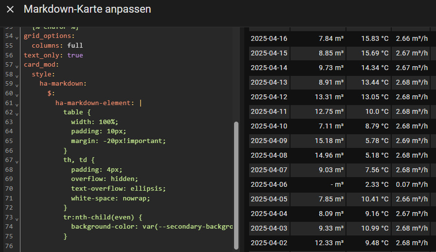
grid_options:
columns: full
text_only: true
card_mod:
style:
ha-markdown:
$:
ha-markdown-element: |
table {
width: 100%;
padding: 10px;
margin: -20px!important;
}
th, td {
padding: 4px;
overflow: hidden;
text-overflow: ellipsis;
white-space: nowrap;
}
tr:nth-child(even) {
background-color: var(--secondary-background-color);
}
The example shows the "Code Editor View (YAML)" and uses the HACS integration "Card_Mod" and thus implemented CSS styles:
By adding the helper for the current page, you can switch between pages in steps of 500.
Instead of a fixed number, the year could also be used for pagination:

...
{% for i in range(0, (data | count)) if (strptime(data[i].localdate, '%Y-%m-%d').year == pagination)%}
...
Card-Mod Style
When using the HACS integration Card-Mod, the layout of the table can be customized, as shown in the examples, different backgrounds for even and odd rows.
...
card_mod:
  style:
    ha-markdown:
      $:
        ha-markdown-element: |
          table {
            width: 100%;
            padding: 10px;
            margin: -20px!important;
          }
          th, td {
            padding: 4px;
            overflow: hidden;
            text-overflow: ellipsis;
            white-space: nowrap;
          }
          tr:nth-child(even) {
            background-color: var(--secondary-background-color);
          }
alternative display: HACS integration: Flex Table
The Flex Table integration is a little easier to set up, but less flexible:

For simple tables ok, but at the latest when linking or calculating certain columns, the Flex Table Card reaches its limits, so I would prefer the Markdown Card to the Flex-table Card.
ⓘ Call up data directly, Plotly-Graph-Table
The table view of Plotly-Graph should not go unmentioned at this point. Originally designed for displaying charts, Plotly-Graph can also display historical data as a table: Directly and without using a query in advance.
type: custom:plotly-graph
hours_to_show: 999
entities:
  - entity: sensor.pv_panels_energy
    type: table
    period:
      "0": day
    statistic: state
    columnwidth:
      - 16
      - 20
    header:
      values:
        - Date
        - value
      fill:
        color: $ex css_vars["primary-color"]
      font:
        color: $ex css_vars["primary-text-color"]
    filters:
      - delta
    cells:
      values:
        - |
          $ex xs.toReversed().map(x=>
            new Intl.DateTimeFormat('de-DE', {
              day: '2-digit',
              month: '2-digit',
              year: '2-digit'
            }).format(x))
        - $ex ys.toReversed()
      align:
        - center
        - left
      fill:
        color: $ex css_vars["card-background-color"]
Example 2: several columns with different sensors:

type: custom:plotly-graph
hours_to_show: 999999
entities:
  - entity: sensor.heating_water_energy
    type: table
    period:
      "0": day
    statistic: sum
    filters:
      - delta
      - store_var: water
  - entity: sensor.flowmeter_sum
    type: table
    period:
      "0": day
    statistic: sum
    columnwidth:
      - 16
      - 10
      - 10
    header:
      values:
        - Date
        - Flowmeter
        - Water
      fill:
        color: $ex css_vars["primary-color"]
      font:
        color: $ex css_vars["primary-text-color"]
    filters:
      - delta
    cells:
      values:
        - |
          $ex xs.toReversed().map(x=>
            new Intl.DateTimeFormat('de-DE', {
              day: '2-digit',
              month: '2-digit',
              year: '2-digit'
            }).format(x))
        - $ex ys.toReversed().map(x=> x.toFixed(2))
        - $ex vars.water.ys.map(x=> x.toFixed(2))
      align:
        - center
        - left
      fill:
        color: $ex css_vars["card-background-color"]
grid_options:
  columns: full
  rows: 12
The table view in Plotly: works, but is definitely not its core competence. Plotly is neither visually convincing nor easy to use (scrolling behavior). The data cannot be exported or copied to the clipboard. For these reasons, I cannot recommend Plotly for displaying tables.
Conclusion
Home Assistant has its strengths in displaying current values and has great data visualization capabilities. However, certain other solutions offer more for storing and displaying historical data. Not only when visualizing charts, but also when displaying tables, Home Assistant could take an example from other visualization solutions such as Grafana. As a solution, I am working on a HACS integration in parallel to this guide: now available: Tables & evaluations in Home Assistant.
 ({{pro_count}})
{{percentage}} % positive
 ({{con_count}})